Space Holder
Level Designer / Lighting Artist / VFX Artist
Space Holder is a VR sci-fi roguelite shooter which I worked on in my senior year of college for 4 months. This game can be described as having a funky/groovy atmosphere, although elements of horror should still be present. The player should always be fearing what lies around the corner or in the darkness, and I tried to encapsulate both of those feelings through my level design, and lighting choices.
You can download the project on itch.io Here
Space Holder is a VR sci-fi roguelite shooter which I worked on in my senior year of college for 4 months. This game can be described as having a funky/groovy atmosphere, although elements of horror should still be present. The player should always be fearing what lies around the corner or in the darkness, and I tried to encapsulate both of those feelings through my level design, and lighting choices.
Level Design Work
When designing these levels I took a "theme first" approach. Before coming up with a layout, I would first look at the assets available to me and draft up an idea for a room that would fit within the context of a spaceship.
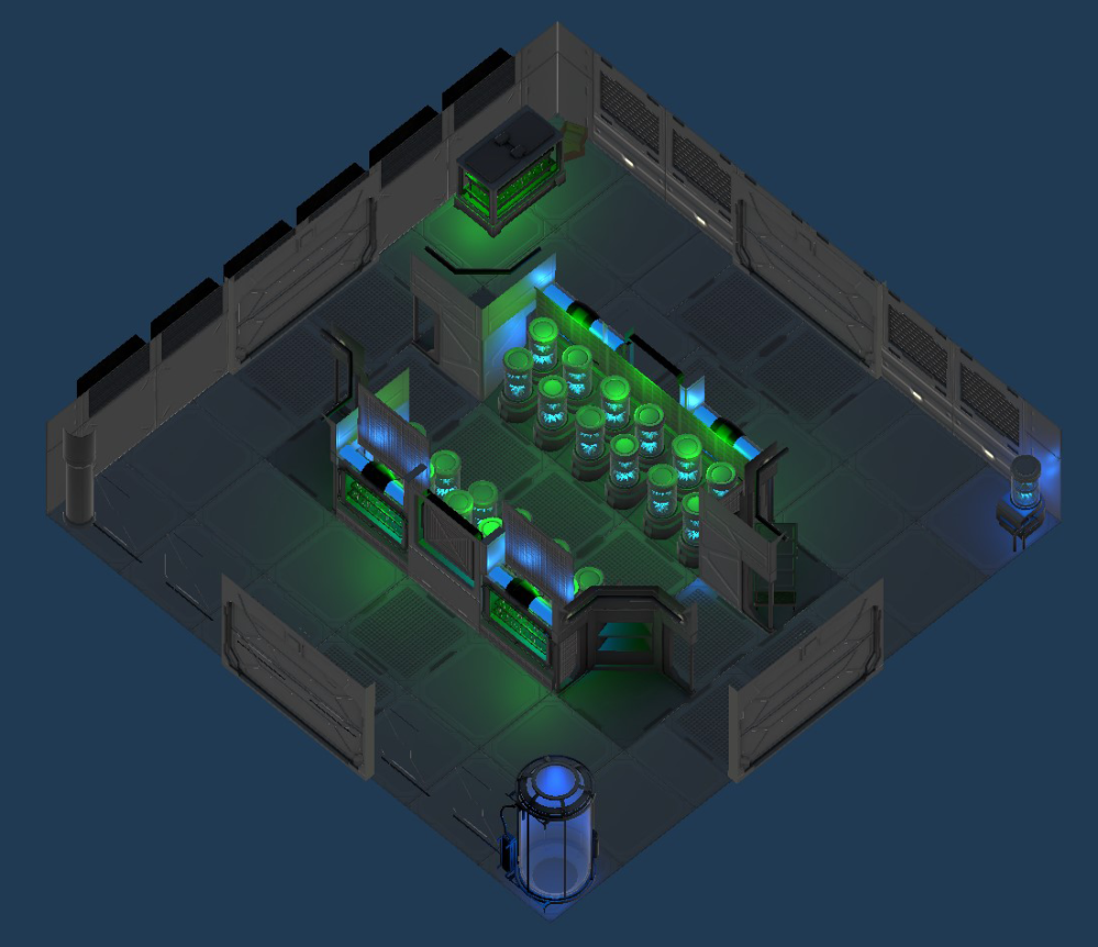
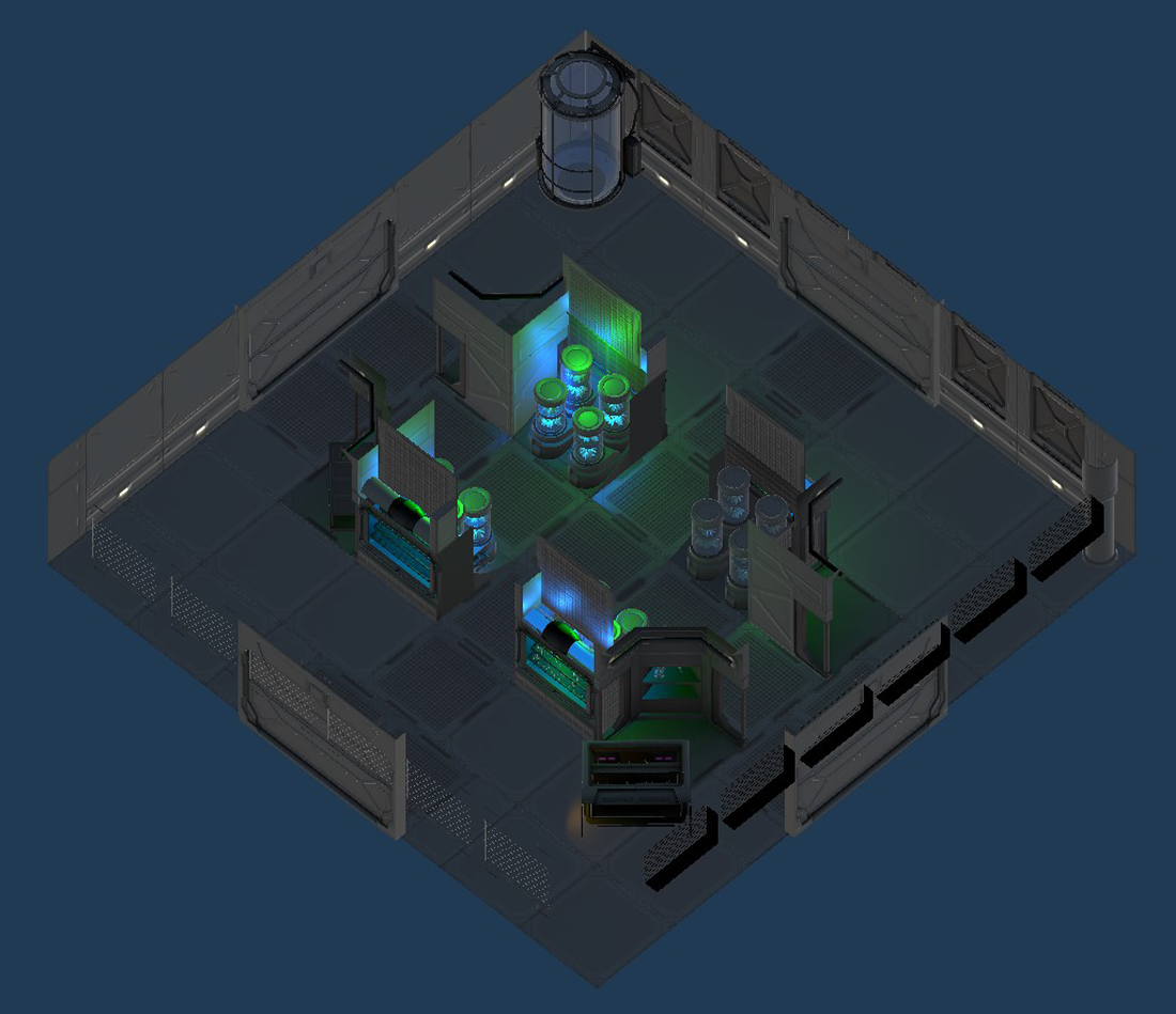
The first of these was the Hydroponics Room, seen to the right here. For this room I wanted to have the player feel cramped with a long thin corridor running through the middle which is closed off on both sides. This was to make the player feel like they would be taking a risk by going through the center here, as the only escape would be at each end.
When designing these levels I took a "theme first" approach. Before coming up with a layout, I would first look at the assets available to me and draft up an idea for a room that would fit within the context of a spaceship.
The first of these was the Hydroponics Room, seen below. For this room I wanted to have the player feel cramped with a long thin corridor running through the middle which is closed off on both sides. This was to make the player feel like they would be taking a risk by going through the center here, as the only escape would be at each end.
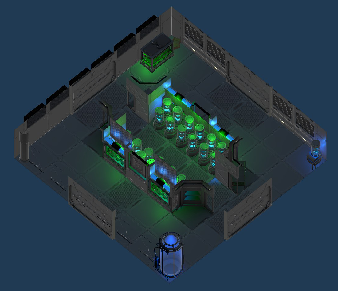
To save time on level creation, I created an alternate version of the level using the original as a base, effectively doubling the amount of rooms in a fraction of the time. Here you can see the alternate version of the hydroponics level. Here the long corridor is broken up by an opening on either side in exchange for an overturned shelf blocking passage in the bottom corner.
To save time on level creation, I created an alternate version of the level using the original as a base, effectively doubling the amount of rooms in a fraction of the time. Here you can see the alternate version of the hydroponics level. Here the long corridor is broken up by an opening on either side in exchange for an overturned shelf blocking passage in the bottom corner.

Below is the lab room, This is a fairly simple and open room. However there is little to no cover except for the edges, which can cause the player to get cornered if they are not careful.
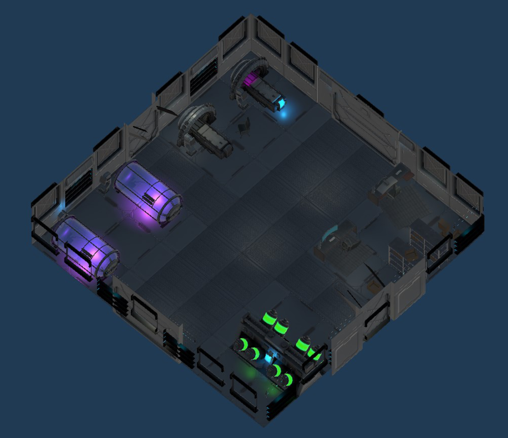
Below is the lab room, This is a fairly simple and open room. However there is little to no cover except for the edges, which can cause the player to get cornered if they are not careful.

When designing these levels I took a "theme first" approach. Before coming up with a layout, I would first look at the assets available to me and draft up an idea for a room that would fit within the context of a spaceship.
The first of these was the Hydroponics Room, seen to the right here. For this room I wanted to have the player feel cramped with a long thin corridor running through the middle which is closed off on both sides. This was to make the player feel like they would be taking a risk by going through the center here, as the only escape would be at each end.
Here is the alternate for the lab room. With these rooms, I tried to make them visually distinct as well, so even though the layout is similar except for the overturned desk in the center, they still look different.

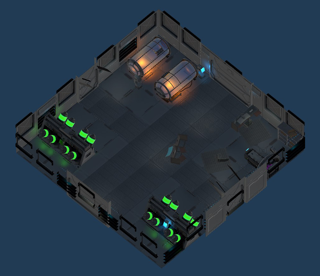
Here is the alternate for the lab room. With these rooms, I tried to make them visually distinct as well, so even though the layout is similar except for the overturned desk in the center, they still look different.

Here is the bunk room, this room features four corridors the player can navigate their way through. There is no straight path to the exit, so players must be wary of what migh be hiding around the corner.
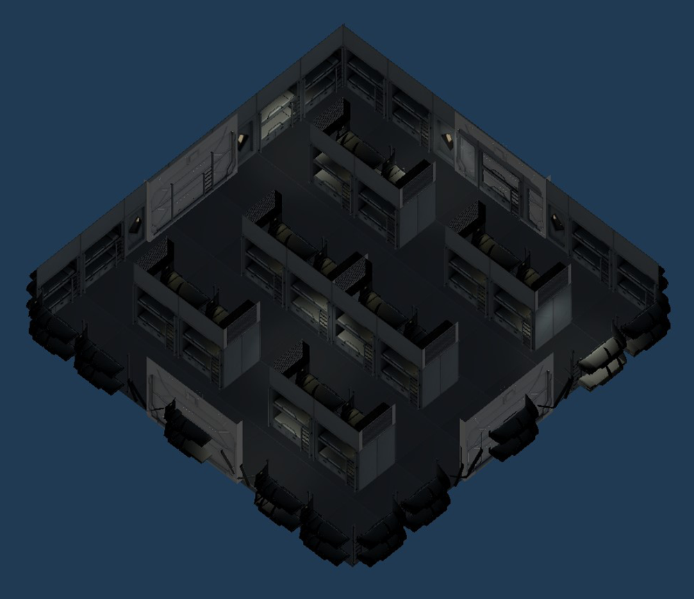
Here is the bunk room, this room features four corridors the player can navigate their way through. There is no straight path to the exit, so players must be wary of what migh be hiding around the corner.

When designing these levels I took a "theme first" approach. Before coming up with a layout, I would first look at the assets available to me and draft up an idea for a room that would fit within the context of a spaceship.
The first of these was the Hydroponics Room, seen to the right here. For this room I wanted to have the player feel cramped with a long thin corridor running through the middle which is closed off on both sides. This was to make the player feel like they would be taking a risk by going through the center here, as the only escape would be at each end.
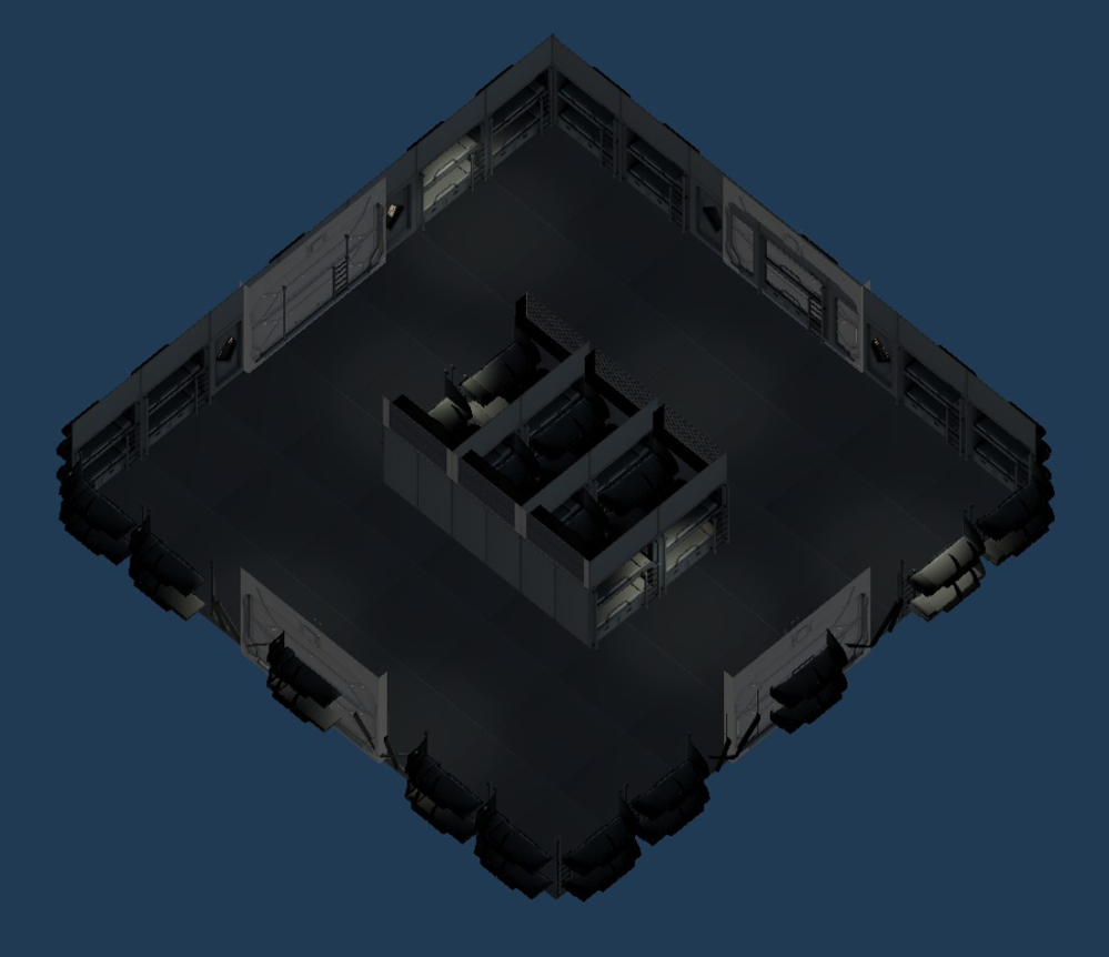
This is the alternate for the bunk room. It is the most simple room I created, and this was to contrast the complexity of the regular bunk room.

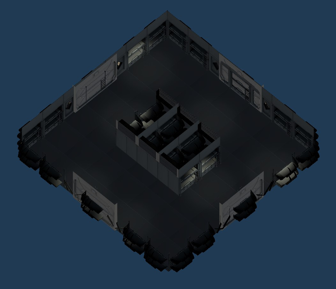
This is the alternate for the bunk room. It is the most simple room I created, and this was to contrast the complexity of the regular bunk room.
Lighting Work
For the sake of clarity, I did not use the in game lighting in the examples shown above. To the right here is a slideshow of how they actually appear in game.
For the sake of clarity, I did not use the in game lighting in the examples shown above. Below is a slideshow of how they actually appear in game.
VFX Work
